Wednesday, October 28, 2015

OUGD401 - History of Type - Lecture

The history of type lecture taught me that I must have my own opinions in order to become an individual graphic designer with my own methods and principles. From a standpoint, there are two main theory's of type, Modernist and Post Modernist, which outlay a set of rules to attend to. Modernist type is the idea that there are a set of rules and principles that you can get right or wrong when designing a typeface. This was the tutors beliefs however, I come from a more post modernist view where I believe type should be more extravagant and decorative, this is probably due to the fact that, from a young age, I have been extremely interested in graffiti and bespoke illustrated typefaces. As illustrators and graphic designers creating type, we start to look at the emotions, accent and tone of the word to influence the design of our letter forms. I believe that you can achieve this more effectively by following post modernism and adapting a more controversial unique way of creating type instead of being constricted by rules and barriers. There is no single approach in a post modern world which means that every piece of typography has to be analysed individually. I do appreciate the teaching of modernism that type must follow a function however, as a graphic designer, I choose to use written literacy more to read the form and emotions of the letters.
Continents and  vowels are a consistent set of symbols for sounds which has been built up from pictures to diagrams to symbols over a period of thousands of years. It is a way of converting spoken language to graphic communication. My view is that as long as these consistent patterns are noticeable in a typeface, then the artist can be as experimental as they want with the text.

Johanne Gutenberg printed a bible using wooden letter press for the first time in 1436. This shows that influence for movable type was to spread the word of religion. From this point the amount of typefaces being created drastically increased as we no longer required hand written methods for mass producing type. However, it was still only the wealthy and religious scholars who could read written language and it wasn't until William Foster implemented the elementary education act in 1870 that the rest of the population started to learn the alphabet. This boosted the need for written language even further and solidified it as it as a significant part of modern culture. As can be seen on the timeline below, type increased drastically during the transitional period into the modern era.


This is where the modernist view of type started to be theorized where people were looking at the function of type instead of the form. Culture moved away from the decorative handwritten typefaces and started to strip type down to its bare bones in its simplest manor. Then the creative craft movement Bauhaus met with mass production between  1919 -1933. This moved type into lead printing of text onto a mass scale. Through this Max Miedinger invented Helvetica which was born out of the necessity for clean clear industrial concise type. This could then be mass produced to be the most functional font in history with its involvement with street signs and subway systems. Helvetica is the birth of modern type which then heavily influenced other typefaces such as Ariel which was released 25 years later by Microsoft  in 1982. In 1990 Steve Jobs. released the first apple Macintosh. This would become the first computer to sell for less than $1000 in 1990 which made it affordable for designers on a mass level. It also introduced a mouse with a computer for the first time which made it available to work with vectors on screen and again boosted creation of typeface into the 21st century.


Tuesday, October 27, 2015

OUGD401 - Study Task 4 - Summarising and Paraphrasing

In the book 'No Logo' by Naomi Kelin, the author is trying to summarize her negative emotions on the subject of branding by exploring her own personal experiences and memory's. She does this very effectively in an informal manor which makes the read more personal and chatty towards the reader.
Her past experiences are explained very clearly, immersing the audience into the authors shoes very effectively and helping them relate to the authors point of view.
Naomi describes that in her lifetime, she has viewed culture being manipulated by branding more as the years have gone by. The authors tone of voice suggests that she is very bias in a negative way towards the idea of branding. She believes that it is suffocating real forms of culture such as artwork, sculpture and dance. But then the idea can be argued, who says branding hasn't become a vital part of modern culture? Who says that an Adidas shoe isn't a piece of artwork in our modern day and age? Just because branding is a new form of culture doesn't mean that it is bad however, the authors point of view suggests that she feels that it is pushing other forms of culture to the sidelines. Now there is hardly anything which isn't branded, even down to online websites such as YouTube which is a platform for sharing culture as a whole. Naomi wants to go back to a simpler time where people weren't judged by the branding which they wore. This can be analysed from this quote


'Tommy Hilfiger, who has managed to pioneer a clothing style that transforms its faithful adherents into walking, talking, life-sized Tommy dolls, mummified in fully branded Tommy worlds.'

Throughout the book, Naomi uses negative metaphors and adjectives such as 'mummified' in order to explain the negative implications which consumerism has on society. She dislikes the way which branding now informs language, attitude and division between groups of people. In some cases, It could be interpreted as new form of racism where people are discriminated against because of the branding they wear.


Tuesday, October 20, 2015

OUGD401 - Study Task 3 - Reading and Understanding a Text

I have chosen to analyse the book No Logo - The Brand Expands - Klein, N 2000


The authors tone of voice is quite chatty, often talking about personal experience and story's from her past. The text is written in a quite informal tone however, the author does use some sophisticated descriptive language.


1

'It is not to sponsor culture, but to be the culture. And why shouldn't it be? If the brands are not products but ideas, attitudes, values and experiences, why cant they be culture too?'

This relates to how brand names and logos have become more than just a piece of art. They have now become signs of our culture, they portray more than just a logo, they can determine the cultural background of that person, where that person originates from and if someone is wealthy or poor. They sponsor football teams which then become part of our experiences. They can relate to a moment of joy when your supported team wins the league or can remind you of other similar experiences with the brand itself. By supporting sports such as golf or tennis, they can become a symbol of happiness or joyful past experiences.


2

'These logos served the same social function as keeping the clothing's price tag on: everyone knew precisely what the premium the wearer was willing to pay for style'

The branding has now become more desirable than the actual clothing itself. This is where fashion comes in and style starts to be left behind. Style is a way of portraying your identity using clothing and products whereas fashion is what is desirable in they eyes of the majority of people other than yourself. People sometimes follow fashion as it comes and goes, this is a point in history when branding was a big part of fashion at the time and the more you was willing to pay for your brands, the 'cooler' you would have been.


3

'Most significantly, the logo itself was growing in size, ballooning from a three-quarter-inch emblem into a chest-sized marquee'

At this point in her life, brand names were getting bigger both in hierarchy and literally on items of clothing. Brands are now starting to get smaller and smaller showing that as the cycle goes back around more people are starting to be more individual again rather than following generic brands. This just shows how cycles work in fashion, hairstyles, art and CD's. The use of vinyl records is currently increasing which is proof of another form of of one of these cycles.


4

'Tommy Hilfiger, who has managed to pioneer a clothing style that transforms its faithful adherents into walking, talking, life-sized Tommy dolls, mummified in fully branded Tommy worlds.'

She is trying to explain in a metaphorical way that some branding is followed that intensely, that it has become like a religion to some people and social barriers are created between groups of people just by the clothing which they wear. She also describes how certain brands can adapt their own language and that certain slang words can be labelled with specific brands. For example, when you think of Ralph Lauren, you think of the wealthy white young golf player who would probably attend private school and speak in a posh tone of voice. You can also label brands such as North Face with people from Liverpool, these are very stereotypical methods as of course not everyone in Ralph Lauren is wealthy and goes to private school however, this is what springs to mind when you think of the brand. This statement states that people can often be grouped underneath brands and possibly judged as a person simply by the clothing they wear.


5

'The rush of branding has become most dramatic in the film industry. At the same time that brand name product placement in films has become indispensable marketing vehicle for companies like Nike, Macintosh and Starbucks.'

This statement is describing the importance of the media and product placement in the growth of branding. For example, the iconic Austin Martin car in bond films has given the car the royalty and classiness which we know today. We do not think of James Bond films when we see an Austin Martin, however, subconsciously our brain processes these familiar signals from our memory's of the film.

Friday, October 16, 2015

OUGD401 - The History of Image - Lecture

In this lecture we were introduced to a broad range of visual communication from different cultures and contexts. I was also introduced to a few philosophical and theoretical approaches to visual communication from such a large time scale. I was quite shocked at the sheer history of graphic design and that some key principles which we learn today come from over 17000 years ago.

Lascaux Caves France, is where the first recorded instances of visual communication in the west starts. These caves are predicted to be over 17300 years old and scholars believe that these are a way to communicate with the gods using visual representations of the spirits of the animals. These dots are interpreted as the spots which you get after hours inside a cave representing what they believed to be a connection between man and god. This is the key principal which graphic designers wish to achieve today by communicating a message to their audience using visual representations. I find this amazing that we can still understand these markings 17300 years later by using visual literacy even though the language of these native humans would have been so much different. This is the power of graphic design and the power of this universal language which we as graphic designers strive to be fluent in.

The artist Cy Twombly creates his work in a very similar style to this native way of painting which i personally find shocking that their are connections in visual art 17300 years apart.


Rothko was another artist which used similar principles to the Lascaux Cave paintings, he also uses a similar style of the dots and cave paintings but in a completely different context. Even though his images aren't believed to be a direct way of communicating with god, his images are still believed to have a spiritual connection due to the framing and the story behind the image. His images are located inside a chapel and the mostly black paintings are related with depression and his eventual suicide. People believe that these paintings were the artists way of communicating across his emotions, on many occasions, his emotions are perceived through his images and large amounts of people have been recorded to cry uncontrollably. This shows the power of what an image can do to its audience and that we as graphic designers can produce images to effect a viewer emotionally, change someones beliefs or even persuade someone to do something out of their own will.


This idea of Rothkos chapel then leads onto religious paintings in chapels all across the world. These paintings are another way to communicate to the gods and pray, much like the Lascaux Cave paintings. It is at this point that i realized that throughout all of history, the principles of visual language tend to be very similar. One example of spiritual paintings is the Papal Altar & Frescoes 1230 where many pilgrims travel each year to view the paintings and gallery's for a spiritual way of communicating through image.


However, it is very easy to get sucked into what somebody tells you to be spiritual, a great example of this is the Mona Lisa. Is it important and famous just because culture and propaganda tells you that it is? It is this use of media and propaganda which gives us a false sense that this is otherworldly and somehow spiritual. The Mona Lisa is also a great example of artwork which has been manipulated hundreds of times across the internet. When we can reproduce images on a massive scale their power can be shifted and changed to have different meanings. Banksys manipulation of the image harnesses this power and instead of being this powerful and auraful painting, it is now a piece of street art which challenges the hierarchy's of this modern day and age. By manipulating the image, Banksy has changed the target audience of the painting from being directed at the pretentious elite group of wealthy individuals to the everyday middle class man walking to work who can now view this without paying a penny.


The image above is an example of socialist realism from the 1920s in which Stalin banned all expressive culture and made people create art in a very strict real way. These was no abstract shapes or surrealism, it was just life like portraiture. This was a way of using artwork as a form of war by pinning the democracy of communism against the freedom of capitalism which was creating very abstract paintings at the time. This way of a dictator using image as propaganda to manipulate a country reminded me of South Korea at the moment where Kim Jong Un is convincing his people that he is almost like a god among men. I personally find it amazing that propaganda can manipulate someones mind so much, it seems unbelievable and almost alien to me.


The last piece of work which really inspired me was Nick Uts image from the Vietnam war which changed Americas opinion and pretty much single handedly brought down America in the Vietnam war. It was this powerful piece of photography which turned a whole nation against itself. I personally believe that no piece of graphic design could portray a message as strong as this which is why i am extremely interested in photography and constantly looking for ways in which i can incorporate photography into my graphics work.


Wednesday, October 14, 2015

OUGD401 - Study Task 2 - Finding Research Sources

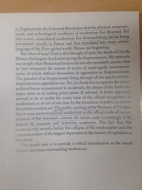
Study task 2 involved using books from the library to find out what the definition of Modernism is. Out of the few books we selected, these two were the most informative. The books were 'Introducing Modernism - Chris Rodrigues and Chris Garratt' and 'Modern Art - Richard R. Brettell'


When searching for books on Modernism, I found that no book would give you a direct answer. The books all assume that you know what modernism is and start evaluating artists work straight away. This was quite time consuming and tedious and we spent over 45 minutes trying to find what modernism actually is. In the end, through pages of reading, we did find a brief overview of what the art movement actually is. I personally found that books can be extremely valuable in some areas of research however, for this particular task, a quick Internet search would have been much less time consuming.

In the end I found that Modernism was mainly started by the upraise of technology around the start of the 20th century and that the use of steam trains, the camera, and the change in industry around the Victorian era was very influential on the direction of artwork and culture being produced at that time.  People started to stop painting kings and life portraits and started to use cubes and abstract geometric shapes as the main components of their work. It was because of this boom in technology that everything related to art in anyway such as architecture or fashion changed so drastically. Some of the researched book pages which I studied in order to write this brief evaluation from are located below.


Wednesday, October 7, 2015

OUGD401 - Visual Literacy - Lecture 2

Visual Literacy - The Language of Design

The lecture itself explains that we cannot presume anything in design and we must question the obvious. It is our job to communicate, we must solve the problems of communication using concept, design and meaning to portray a message. It is our role as young designers to ensure that my work is as effective as it can be. When discussing visual literacy, there is the idea of visual communicating which is a process of sending and receiving messages using only image. For visual communication to work, there has to be a common language between the audience. In the same way that we have developed skills of literacy in the written world in subjects such as English, we must learn, in the same way, to develop a set of visual language skills which can deliver and portray messages. Visual literacy however, unlike written language, can be understood on a global level which is why we must learn about, and understand other cultures so that our work can relate on a global scale. On a daily basis we use visual literacy to interpret simple signs such as road or toilet signs, we associate masculine and feminine colours to interpret which door of the toilet is male and which is female. These basic signs look in no way what a human being looks like however we have learned these signs throughout our life. This shows that pictures or symbols can be read globally almost as a second language.
For visual communication to happen, there has to be an agreement between different groups of people that one image can interpreted in the same way. We need to understand as designers that certain symbols or pictures have multiple meanings. We need to learn that what we can introduce to the symbol can change a audiences interpretation of the meaning behind it. For example by changing the colour of a simple cross from black to red, we have changed the meaning to be the English flag.

We also looked at visual syntax, i was already quite aware of the meaning of syntax due to reading Vignellis Canon However, we were given multiple visual examples which helped me better understand the idea behind visual syntax. Its the idea that the building blocks behind an image such as layout or text, are the simple tools which we use as designers to create an appealing image. The visual semantics refer to the cultural process of communication. it is the thing that we must understand about different cultures, religious groups and age groups to create successful work directed at the preferred target audience. Semoitics is the study of signs and symbols and the process which we interpret those. We then looked at visual synecdoches, metonyms and metaphors which relate to recognizing certain places by just looking at landmarks which relate to the area or objects which relate to a specific country or area.

Tuesday, October 6, 2015

OUGD401 - Study Task 1 - Image Analysis

In this lecture we discussed and analysed two different images to get to grasps with how an image can portray a meaning. We used our new found knowledge of visual literacy to read into the images  The Uncle Sam Range (1876) advertising image by Schumacher & Ettlinger, New York and Empire Marketing Board - East African Transport Old Style' and 'East African Transport New Style'. We were asked to look into the society culture technology politics history of the images and compare and contrast the differences between the images. I personally found that by looking at each individual aspect, it was almost impossible to not end up talking about another one. Even though they seem to be five random topics to talk about, they are actually quite related when analyzing a piece of art.


The image can be analysed by using visual literacy by looking at things such as the slaves which are in the image, the old clothing and the 'Uncle Sam' lettering on the floor which suggests that the image is in 1876 America. The list in the image shows trading between different countries and the text in the image says 'Feeding the world by the aid of the Uncle Sam range'. This suggests that america is feeding the world when in fact they are actually starving the world and using slaves to the benefit of America. The image is extremely patriotic in a cartoony way suggesting that the target audience is america and that the image is celebrating in a very jokey way just how wealthy and powerful america is. The dates on the clock also relate to the united america and show the dates which america became independent which is another area which the poster could be celebrating. In hindsight we can see that the image is celebrating the ignorance of america and just how much america was destroying civilizations and cultures for their selfish own benefit. In 1876 when the image was released, Americans thought that by introducing new trade and technology they were actually helping the different cultures of the world. This shows the power of propaganda and shows how powerful graphic design can be when manipulating peoples opinions. We see it now on every advert on television it is just unfortunate that back in 1876, propaganda was being used to convince the people of America that slave trading was good.


This second image could be advertising to the natives that the new style of transport is better as the image does not show the African natives in chains, it only shows the African people with a better way of travel by using boats and jeeps. It also depicts the native people looking happier on the bottom image under the rule of the white man. On the other hand, the target audience could be the Americans as the image does not show the true brutalness of how we were using slaves. The image does not show the slaves in chains, it depicts that we are helping the natives as the old style transport was all done by hand whereas the new style transport is using boats and jeeps. The image also does not show women and children working and shows that we are almost giving the natives equal rights when in fact the propaganda is fake. This is a good lesson to learn when analyzing the media and makes you realize that not everything we see or hear in the media is true. The image shows the English trying to help the natives develop and not treating them in an unfair way, this could be to try to convince buyers and investors that they aren't doing anything wrong and that slave trade is actually a good thing.

I believe that the second image is the outcome of the first image. Where in the first image they are discussing the slave trade and trading around Europe, Asia Africa, the second image is the actual trade and travel. The people in the first image all represent the trading of different countries.